Uncategorized
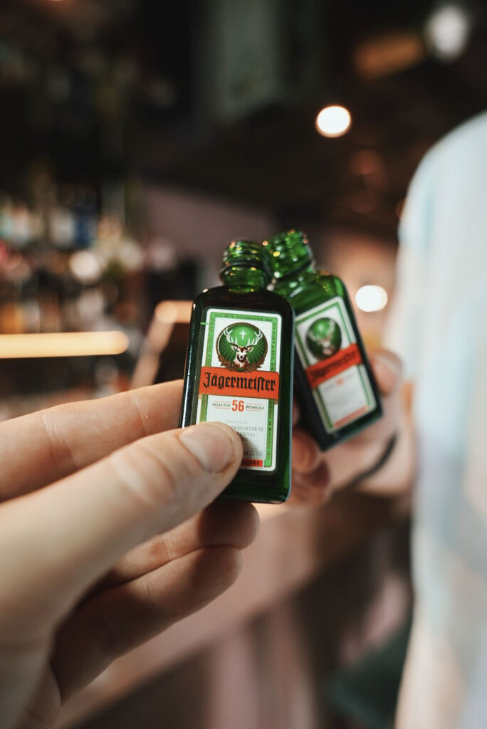
Exciting News! We’re happy to announce our partnership with Mast-Jägermeister SE, one of the world’s most iconic brands, as the exclusive distributor for Latvia, starting from January 1, 2024!
Tridens is honoured to be entrusted with the distribution of Jägermeister in Latvia, building on our success story that began 1994 in Estonia and 2008 in Lithuania.
We distribute over 150 brands, and now, we proudly represent Jägermeister in Estonia, Lithuania, and Latvia.
In the words of our CEO, Janno Hert: “Consumers of established premium spirits brands expect constant inspiration and impulses. A clear focus is therefore particularly important to ensure long-term success. Together, we want to expand the close and trusting partnership based on common values. We look forward to using all our strengths to add many more exciting chapters to the Jägermeister success story in Latvia.“
Jägermeister, a premium herbal liqueur with a legendary recipe of 56 herbs, blossoms, and roots, has captured the hearts of consumers worldwide. It’s an honor to join hands with this iconic brand and continue its legacy of excellence.
We’re excited to take this journey with Jägermeister and bring you even more stirring experiences with this premium herbal liqueur. Let’s toast success, shared values and all the adventures that lie ahead!
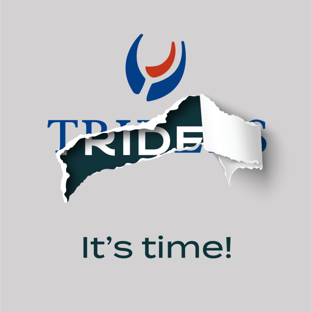
Here we go! Tridens is proudly stepping into the future as today we are launching our new corporate visual identity. We felt it was time to shed the old skin and start anew and we are so excited to show you the results!
The new Tridens identity was developed by Great and Golden, part of Clinic212 creative collective, based in Vilnius, Lithuania. Great and Golden is a strategic design studio creating and developing character in the shape of brand, product & packaging. We contacted them because we believed that their creativity and ideas will transform Tridens exactly how it was needed.
“The task at hand was to evaluate the visual assets of the Tridens brand”, says Lilė Adomaitė, project manager of Clinic212. “With a history of 34 years in business, the question was whether or not the current visual identity conveyed the company’s values and identity. After careful consideration, we determined that the existing visual identity, which had been in use for few decades, was outdated and required an update.”
Process of creating a new CVI
“Tridens has been operating successfully in the Baltics since 1988, the aim was to create a timeless identity reflecting the company’s reliability, extensive history in B2B distribution of premium goods and dedication to serving as an honest and committed partner. Our primary keywords were distribution, historical background, trustworthy partnership, sophisticated and timeless design”, explains Gabija Platukyte, the head of design at Clinic212’s Great & Golden product design & branding studio.
Platukyte says that the first step in the creative process was research and analysis, but updating a brand’s CVI is a complex process. The most challenging part is balancing what needs to be preserved with what is no longer relevant. This involved reviewing brand’s current position and history, competitors, target audience, and all the visual assets that were being used. “We had to identify the essence of the brand so that we could move on and develop creative concepts for the new visual identity. Once we gathered the core information, we proposed several different design directions. After the idea was selected, we developed brand’s logo, colour scheme, typography, imagery, and other visual elements. The selected idea was refined and implemented across all touchpoints.”
Defining feature
Everyone involved with the project are very pleased that they did successfully find a balance between honouring the company’s heritage and historical background, while also infusing it with fresh concepts. “To modernise the brand’s visual identity, we simplified the sea-themed trident symbol in the logo and paired it with contemporary yet timeless typography. Given that the motif of the sea has deep roots in both the history and name of our brand, we have intentionally woven this concept into every aspect of the identity. Specifically, we have incorporated oceanic elements into the logo, letterforms, colour scheme, patterns, and imagery”, says the main designer, Julija Stasiulaite.
A defining feature of our visual identity is an embodiment of a sea concept, which has a historical meaning for Tridens. This motif is evident throughout every aspect of the brand, including a distinctive pattern composed of small arrows that resemble the movement of ocean currents. The design concept is intended to visually represent the process of distributing goods, a widespread and efficient delivery. The pattern is dynamic, it goes in diverse directions, expand and contract, forming unique and intricate compositions. It is a versatile and adaptable visual element that adds depth and significance to the overall visual identity of Tridens.
Marketing and design people know that it is important to ensure that the brand’s new visual identity is aligned with the brand’s goals and resonates with the intended audience. Brand recognition is also a crucial factor to consider, as changes to the brand’s look and feel must be carefully managed to avoid alienating customers and stakeholders. The design process must be managed collaboratively with all the team, and the new CVI should be implemented consistently across every touchpoint to ensure a seamless and cohesive brand experience.
“I believe that Clinic212’s team did a wonderful job with the task at hand and our new CVI reflects everything Tridens stands for, which is being a reliable partner for our customers, shareholders, our community and Tridens family. We have been here for 34 years and now with the help of our new CVI we are proudly stepping to face the next 30, 40 and 100 years”, said Tridens CEO Janno Hert.
Tridens’ new Pan-Baltic partner from 2022 is the widely recognized wine house COCCHI. COCCHI started creation of flavored and sparkling winesm such as Asti docg and different types of vermouths in s small Italian village named Asti, in Piemonte region. These creations were developed by a young and talented pastry chef Giulio Cocchi, and production began in 1891. COCCHI achieved success and fame in a short time due to their quality, taste and uniqueness of their vermouths. These vermouths have been the bestselling and most popular brands for six consecutive years, according to Drinks International Magazine. COCCHI has been a family business ever since, now over more than 130 years.
Basis of cocktails
If you are interested in learning more about COCCHI vermouths, it is worth starting with the classics: Vermouth di Torino Storico. It’s the basis of classic cocktails such as Negroni or Manhattan. Bitter orange, cocoa and rich notes balanced by citrus freshness, Storico has been a protagonist of the international renaissance of high-end vermouths and is used in the world’s best bars. 🍸
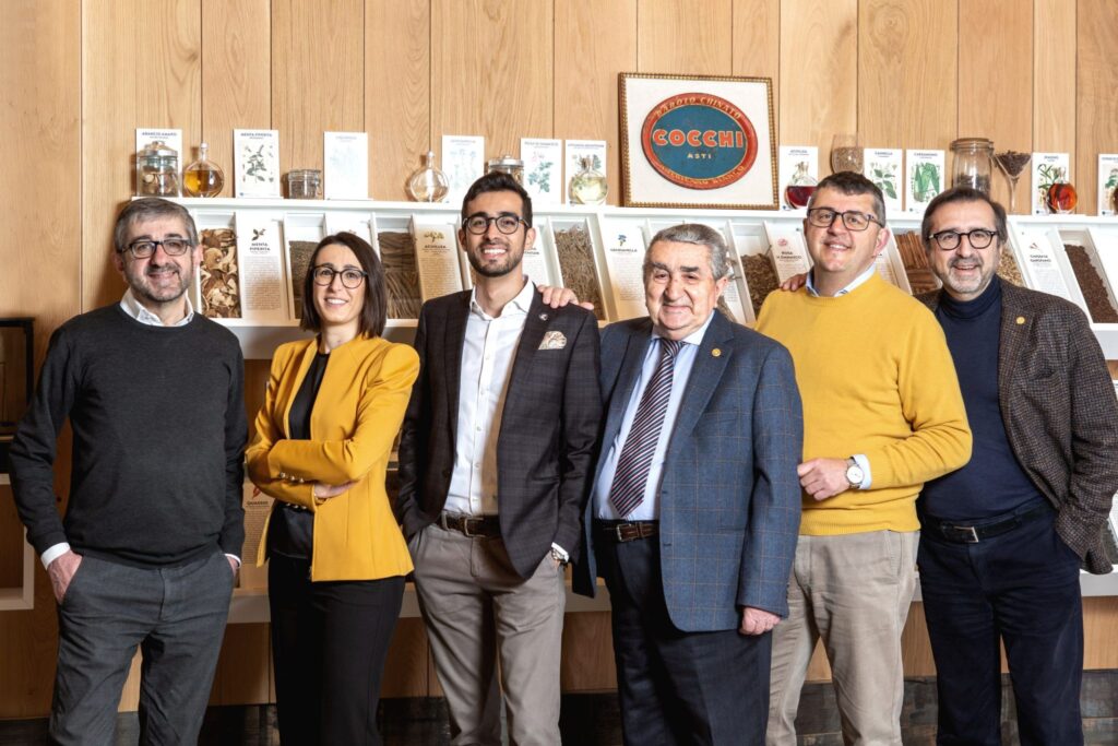
Tridens is proud to announce COCCHI as a new partner on Pan-Baltic level!
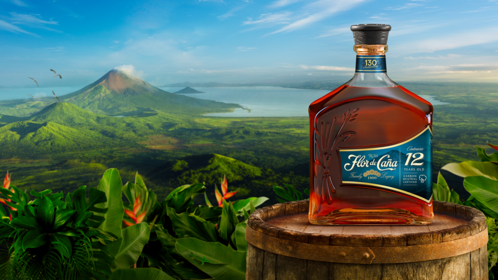
2022 has brought a lot of fresh air to Tridens portfolio and we can proudly introduce one of our new Pan-Baltic rum brand Flor De Caña. Did you know that our brand Flor de Caña is the most sustainable rum in the world? Now you know!
There aren’t many spirit brands in the world that can proudly say that they are 100 percent fair trade and carbon neutral, but Flor de Caña is the first of its kind that got both certifications. During the production process, Flor de Caña rum is distilled in five different distillers for hundreds of times. Each rum is aged in a charred oak barrel previously used to age bourbon. In addition, all kosher requirements are followed. The rums are aged from 4 to 25 years (although it is also possible to try more exclusive rums at the factory). Both light and dark rums are produced, and all drinks are Premium class.
Flor de Caña brand representative Mauricio Solarzano explains that the volcano San Cristóbal, at the foot of which the drinks are born, is their biggest support force and their most important laboratory. “Our sugar cane fields are very, very close to San Cristóbal – only eight kilometres away”, he says. “The volcano absorbs a lot of water when it rains. Water goes into the soil layers and enriches the soil with minerals – including the water we use to irrigate our sugar cane fields. Sugar cane thrives in such fertile, volcanically enriched soil. Every time a volcano erupts, the ash is a natural fertilizer for our fields.”
A big role is played by the microclimate in which the rum ages in barrels. “In a colder place, the pores of the wood begin to close”, explains Solarzano. “But in a humid tropical place like Nicaragua, the pores of the wood begin to open intensively. The interaction between the alcohol and the wood of the bourbon barrels is more intense, more dynamic. This is the magic of the Flor de Caña aging process.” During the magic, all the sugar is distilled out of the drink, which is why Flor de Caña is lower in calories than other similar drinks. Moreover, there are no additives or other artificial ingredients added to the rum.
The most important aspect for the brand and for us at Tridens is the sustainability. A lot of our brands have a target audience of young adults (18+), and we try to make it our mission that when they inherit the planet it will be in better shape. It is possible to mix the magic of experiences and being ecologically conscious and responsible.